Thursday 15 December 2011

Two block linocut

Multi-block printing means you can have different colours in your prints. It also means separate plates for each colour.

Here you can see an example by my heroine, Lilli Tschudi.


Picturing which part of the image you have to carve and how the two (or more) colours will combine, and making sure they register in the right place, is complex. Fun, but complex.

These are the two plates, carved on Japanese vinyl. - I had to finish the second at home.


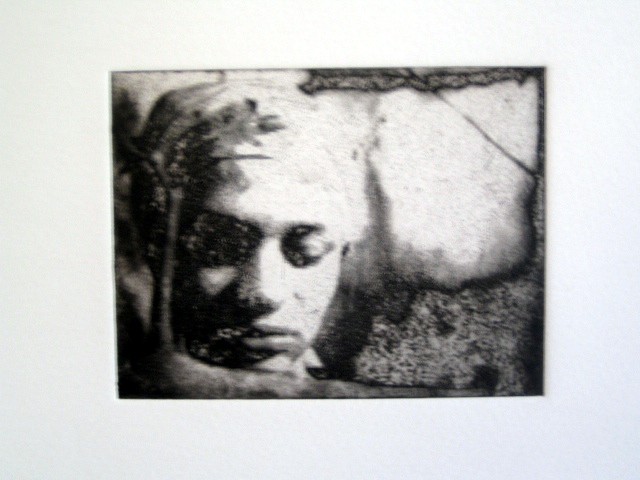
This is an image pinched from a painting by German expressionist artist Kirchner. (I don't like copying other artists much, though it is educational, but sometimes during workshops and work you don't have time to think ideas up.) A girl on a sofa with stripey dress & stripey socks, a little cat curled up next to her, I felt an affinity. Plus the stripes would translate well onto a print.

I I only got one plate finished in time and decided to print it up by itself in one colour, just to see. Which do you prefer?


Friday 9 December 2011

The cruel life of dancing bears


Intaglio version of the same plate. You can see the lines of the man's face, the tambourine and his hand were carved too deeply to hold the ink when printing it as an intaglio print, so they've printed as white.


Inspired by a dream I had about chained bears ...

This was made in a workshop using Japanese vinyl, which is soft like butter after carving into lino.

It is relief printing (that is, the ink sits on top of the plate, ie the bit that sticks up is what prints, and what is carved prints as blank space) unlike intaglio printing, in which the ink sits in the lines you carve and is squeezed out by the pressure of the press.

Today the teacher showed us how to use the same type of vinyl to make intaglio prints just by inking up in a different way. I printed this bear picture up today using the intaglio method too, and I think I like it better as an intaglio print. I'll post the intaglio version when I pick it up next week, so you can see the difference.

Thursday 8 December 2011

How not to make a reduction linocut

We learned how to make a reduction linocut at the workshop. You carve away parts of your image successively (so your print run is limited) and print up layer over layer of different colours. You have to imagine your lino tool is a different colour pencil each time when you're carving it out, to keep the different colours straight in your head.

I was out of ideas and asked on Twitter for suggestions. One that I liked was "an Iguanadon giving a thumbs up like Fonzie" (see below) but this was a bit complicated as we had 10 people making 8 prints each with the reduction method, so time was tight.


This robin was a bit simpler.


robin plate


I still cocked it up though. What colour is fairly key for a robin red breast? What colour did I do instead? Oops.


robin on purple


robin on blue

Saturday 8 October 2011

More life drawing

I started a new life class with a magnificent tutor. He talks all through it... talks talks talks... but this is brilliant, as drawing can be a lonely business, especially when you don't know what you're doing. I'm still at a very basic level but am starting to see how it's done, now that he's handed me the tools for looking and for drawing, and I can see it coming together. It is a magic process.

This class also has a male model, which is good, as I've never drawn men before. I've noticed when we walk around and look at each other's work that it's not just me that avoids drawing his male bits. It is a surprisingly strong taboo, staring at a stranger's genitalia, especially in a room full of other strangers, even if you are there for that very purpose.

This charcoal drawing amused me, because though I couldn't see it from the angle I was drawing from, afterwards when I looked at it, a cartoon willy in the shape of a shadow had somehow sneaked in... It's what you might call a Freudian slip. Can you see it?


blurry cameraphone snap - was trying to avoid taking picture of the actual life model

Friday 1 July 2011

Red shoes linocut

Update: the finished print. Well, nearly. I need to think about how I will make the shoes red. Maybe I'll paint them, or a technique called Chine collé.


After seeing Kneehigh's beautiful, spectacular, dark, twisted, funny cabaret based on Hans Christian Anderson's story of the Red Shoes, it gave me lots of ideas for prints, which maybe one day I will have time to embark on...

In the meantime, I thought I'd do a linocut, which is the simplest idea. Here are some photos of each stage. It's still not finished but this gives an idea of the process.

When I was thinking of the story, what seemed to come through most vividly was Karen sitting in church, unable to stop thinking about her red shoes. There are old ladies in the story and I pictured her sitting in church, a young girl surrounded by disapproving old women. For me the story is about her blooming into a woman, and other people trying to dampen down her sexuality (maybe for Kneehigh too - they changed the old soldier in the original story into an handsome young soldier who tries to seduce her.)


1. Drawing out the design on the lino.


2. Lino all cut. It takes a while.


3. Printing the red shoes in red first.


4 Inking up the rest of the plate with black ink. This is the most exciting bit (after pulling the print) because you see your image come to life as the ink runs over it.


5. The print. This was printed by hand burnishing with a metal spoon, but it gives me an idea what it will look like when it goes through the press. You can see some problems with registration (red not in the right place) and I think the paper moved, which causes the blurring. But still quite happy with it overall.

Saturday 18 June 2011

Photoetching


A very, very old photo (in fact my model lost the negative, so this was blown up from a teeny tiny contact strip) that was turned into a photoetching. This accounts for the blurry nature of it.

This was my first experience of using Photoshop. It is a great tool but there's a lot to learn. I think this is far more gritty & grainy than I'd imagined, I need to practice.

I think I prefer the old school technique of using a photocopy, instead.

Tuesday 14 June 2011

Monoprints


This figure (from the mobile I made for the Freud Museum exhibition) was a monoprint. It's the simplest technique but unrepeatable, unlike most forms of printmaking. You can draw your image into ink on a smooth surface (maybe glass or plastic) then rub your paper carefully onto it - it will pick up the white space of the design. Or as in this case, you can paint your design in ink then place it against your printing paper - the kind of method kids use to make symmetrical butterfly pictures.

Here not all the 'information' (as proper printmakers say) got transferred to the paper so I had to cheat a little bit and draw in the detail. It also led to me cheating as I had to scan and print it in reverse (as you can't ever repeat a monoprint exactly. And especially not in reverse.)


cheating


The figure at the bottom in the second photo was also made this way. Monoprinting is simple but fun. With practice you can probably refine it and get some more sophisticated results.