Sunday 27 April 2014

Bus lady

I jumped on a lovely new Routemaster at Westminster, heading for Charing Cross (Thomas Heatherwick came in for some stick over the new bus, I don't know why. People are so fussy, I think they're great.) Across the aisle was this magnificent woman.

I took a stealthy photo of her in the few minutes before I jumped off at the Strand.

First she was a sketch 

And next she became a watercolour.


I like drawing big women. I can understand Lucian Freud's love of his Benefits Advisor. 

Also somewhere in the back of my mind I think was this Hockney portrait of Divine ,
though his is so colourful and beautiful, Matisse-like, I may go back and  rework it.

Friday 25 April 2014

Friday Night Draw

Friday night is good for free drop in drawing at the National Gallery, the National Portrait Gallery and probably other places.


Hands...

The teacher told us just to draw the arms and hands in this painting. Trying to get them in the right place. 

Yes, some are suffering from 'bunch of bananas' syndrome, but just you try it.

This was a great exercise, if you went to the National Gallery everyday and concentrated purely on drawing hands,you'd get much better at it.


This was from Gentileschi's The Finding of Moses.


 I can now tell you that Gentileschi was a contemporary of Caravaggio (who got him into trouble, Caravaggio being the trouble maker he was). This was commissioned by Charles I when Gentileschi visited England.

This painting was a bit of propaganda and a PR attempt for Charles; as Moses was the little baby who was nearly executed,  went on to be king of his people and led them all out of slavery.

Monday 21 April 2014

Oil vs watercolour

We're about to start our second painting module, working in oil paints.

I enjoyed working with oil in the studio, but was not particularly enamoured by what I made - it looked like some horrendous kind of 70s wall art that you'd find in the lobby of an office block, in the 70s. All orange and purple.

This tutor is keen on us doing abtract work but I've come to realise I've got no imagination whatsoever. This makes abstract work hard. I'd rather tackle something I can see in front of me.

Anyway, I asked her to recommend some oil paint and she said not to bother with the student brands.
I bought a little starter kit of Michael Harding paints and started yesterday with them, but I think it is pearls before swine.

We have to paint and draw observations of a room we live in now, and memories of a room from the past.

Really not very inspired at the moment.

Currently, watercolour is winning out over oil paint. It seems to do a bit more of the work for you. You can get away with more, it's more suggestive.

Watercolour


With the oil paint, what I've made is so crude, it makes me want to set in on fire, then bury it in the garden.

(It reminds me of my friend Emma, when asked to do a drawing for our friend's little girl. "What I drew was so bad, it made her cry.")
 
Oil paint 

Also, the turpentine gives you a wicked headache. Looks like I might be a wussy watercolourist, not a macho oil painter.

Wednesday 16 April 2014

King Kong

After confusion (see last post) of trying to sort my ideas out, I decided to give my brain a rest and do something completely different, on the side, just for fun. It came to me in the shower, like a flash.

KING KONG. Oh sure, it's been done before, but not MY King Kong. (The 1930s film, not the 70s or 2000s remakes, clearly.)

I love the film. Who doesn't?

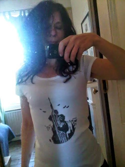
When I finished this in the screenprinting workshop, everyone was a bit 'meh'. But I think they thought I'd copied the image from somewhere. I didn't copy it, I made it from scratch. It went through this laborious process, a mix of drawing, photocopying, and very basic photo software trickery, detailed here for your pleasure...


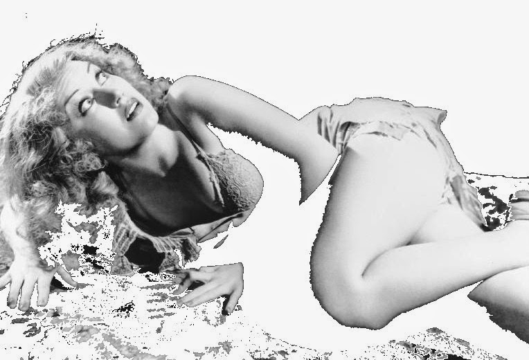
Here he is, from the 1933 film. He looks rather scary. I know it was a kind of horror film, but it doesn't really do justice to the pathos of character.

(Can I take a moment to say, biplanes, giant gorillas, Empire State Building, New York skyline, half naked fainting woman - they knew how to construct a killer scene back in 1933.)

Fay Wray. I think this was the actress' name, I forget the character. Wasn't she gorgeous?

I drew Fay.

I drew the Empire State building from a photo on the internet.

 I drew a gorilla climbing a tree, from a photo on the internet.
I put them altogether, by a cunning combination of scissors and computer software.


I inked them in, (as demonstrated by Le Gun artistes, who draw then ink their work. I like working with brush and ink.)

At the screenprinting workshops, we exposed our images onto screens with photo sensitive emulsion and then printed them on fabric.

And voila... the mighty King Kong, on fabric.


Fay got lost on the bag.  My excuse is, I'm not very good at this.

 Printed him a bit too low on the tshirt. Never mind, it was a first effort.


Saturday 12 April 2014

Fun with Photoshop

These are from our module on Photoshop. I don't know how I ever lived without it. But I also don't know if I can afford it - £500 for the professional version. Ouch.
Original photo


Original photo


Original photo


Friday 11 April 2014

Juggling

Painting project - sketches based on memories of a room you lived in and observational sketches based on rooms you live in now. Can be details of the room, or a view out the window

These will form the basis of a painting. I might cheat and pretend I can see something out of my window that I want to paint anyway

Fabric screenprinting - a short workshop I took at ELP to learn how to print on fabric., for an idea for our long project in year 2

Learning that bold lines and shapes are best for screenprinting for it to come out well and make the most impact.Getting a bit confused as this is often for people wanting to make repeat patterns for clothing or furniture fabric, but I'm thinking of it more as making a whole image. (except on fabric not paper)

What I want to do is recreate surfaces (like wood, or rusty metal) but you need quite strong high contrast source material to expose the image onto the screen. Grey tones are not picked up, you have to make your source image black and white and high contrast.

Work for the ELP summer show on the Southbank

I had to rein myself in as my first idea was to make a deck of cards to make an installation.(Resisting putting the word installation in inverted commas, now I am actual art student). I like to make life complicated. Most people do just one print and frame it then they're done. They don't stress themselves out. I like to take on huge projects that I have no time for.  last time I made an alphabet with 24 prints and it was hard getting it done in time. 52 separate prints is just crazy talk, so I've regretfully put it on the backburner.

I am trying to recycle some drawings for this so I'm halfway prepared already.

We also have a drawing project coming up which will go over a few weeks.

All these ideas are getting tangled up. I was also a bit confused by a charming French lady I met on the screenprint course who bombarded me with questions about the 2nd year project. It was lovely to have someone show so much interest and insight, but it did mix me up a bit.

"You have the idea. Now you need to have the theme." I thought I had the theme, but now I'm confused.

I think one of the things that marks the professionals from the amateurs is having the confidence to talk about your ideas and what you are doing, even if you don't feel confident.
Though sometimes I get resentful at having to explain myself. Did old time artists have to provide artist statements?*

 "So, Van Gogh, what exactly are these sunflowers all about?"
"They're just sunflowers. I wanted to paint them. Alright?"
* Not comparing myself to Van Gogh here